This is what a process comparison looks like
Six joining processes side by side — which one is pulling ahead, which one has matured?
What the chart shows
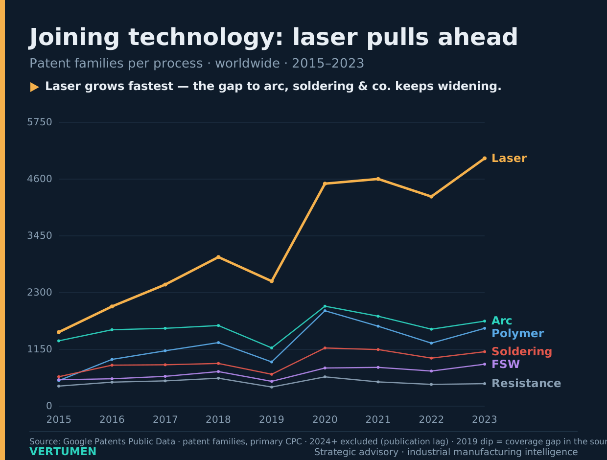
The number of patent families per joining process and year, worldwide, from 2015 to 2023. The comparison covers laser welding, arc and plasma welding, polymer joining, soldering and brazing, friction stir and pressure welding, and resistance welding.
How to read it
The horizontal axis shows the earliest filing year of a family, the vertical axis the number of families (0 to roughly 5,750). Each line is one process and is labelled directly. The dip at 2019 is not a market movement but a coverage gap in the source; it affects all processes equally.
Finding
Laser grows fastest and keeps widening the gap to every other process. That does not make laser the largest market — mature processes such as resistance welding see few new patents even though they run in millions of production lines.
Methodology in detail